Tokopedia Cart Revamp Cart page on desktop
Scene 1 1
Enhance the experience & interface, Improved information architecture, simplifying for the Cart page on Tokopedia desktop. Micro-interactions made the experience more delightful.

This project Increased conversion from Cart page to Order Created in session significantly.
Product Web Desktop
Contribution Interface Design
Experience Design
Interaction Design
User Research & Testing
Interactive Prototyping
Timeline Oct - Dec 2023
Project
Overview
The cart page is an intermediary page on the buyer funnel for users to collect, compare, and arrange their products before proceeding to checkout. From the number of daily users who add products to their cart, only one-third proceed to the checkout page while the rest are deleted and some are left in the cart.

There are two types of users based on their intentions, High-buying intention users usually buy products in a short time. Meanwhile, the low-buying intention user type takes longer to complete their shopping.
Role & Responsibilities
  • Responsible for projects involving & collaboration with several different tribes, such as the Promotion team, Dilayani tokopedia team, Recommendation team, and Basket Building Team,
  • Main role are as Interface design, Experience design, Research, Interaction design, and prototyper.
  • I work with the Design system team, Product manager, Product Design Lead, Front end engineer, backend, Data Engineer, and ux writer
Tools and methods used
  • Figma, Docs, Jira.
  • Collaboration, Usability testing, Affinity mapping.
Problem Statement
What problem were you solving?
  • We aim to refresh the UI of the Cart & Checkout pages on the desktop since the design has been far behind for quite a long time. 
  • Many business initiatives that are currently running in apps are not provided on the desktop
  • Improve performance and scalability
  • Improve the user experience
Why was it important? Causing a pain point of inconsistency for users when using Tokopedia. Pursuing design parity across Apps, LITE, and Desktop platforms can benefit us in ensuring that all users have equal access to the platform's resources or services, regardless of their background, capabilities, or location.
Research
Research methods
  • User Interview / User Testing
  • Performance Data
  • RAD Report
  • Competitive Research
  • Affinity Mapping
Key insights gathered
  • The majority of users use the desktop to search for items, compare them, and add them to the cart to then check out on mobile.
  • Some pay attention to items that are urgent to buy
  • Some only want to know the shipping price to compare
  • The user interface is not updated so it is not attractive and to much text, and then the program code is outdated so it is not scalable.
  • Most competitors have a clean and modern interface, making it easier for users to see and differentiate each part of the content presented.
Design Principle As the essential part of the buying journey, cart aim to be smart modules that help customer to purchase, maximize benefit, and manage their transaction easily. This is with principles that cart should be relevant, empowering, reliable, and engaging.
Cone_01 2
Relevant
Sphere 1
Empowering
Cube_02 1
Reliable
Icosahedron 1
Engaging
Relevant The information we show on cart page should be relevant based on the user behavior.
Empowering All the information presented is easy to understand (copywriting and the design straight forward) and based on the maturity level of their decision-making process.
Reliable Users can be ensured that they can understand the details of their purchase (Transparent / clear information)
Engaging The information structure and communication would be delivered in a manner that is easy to grasp, just like reading a quick story about your purchase.
Ideation Process Based on the research insight above, I and team conducted brainstorming to gain new ideas and various solutions. The method that we use to narrowing ideas is a How Might We? (HMW) to explore ideas are possible solutions, low effort and hight impact.
Problem
The user interface is not updated so it is not attractive and to much text, and then the program code is outdated so it is not scalable.
User with Low-Buying Intentions takes longer to complete their shopping because they only add products to their cart to save temporarily and then compare. Then continue shopping on mobile because free shipping vouchers are not available on desktop.
How Might We?
  • How might we design a cart page that makes it easy user for complete their shopping?
  • How might we design the cart page more attractive dan user-friendly?
  • How might we design the cart page more modern while still being useful and user-friendly?
  • How might we design free shipping vouchers that can be used on the desktop?
  • How might we design a cart page that displays free shipping vouchers that ase easy to use to complete shopping on the desktop?
Information Architecture IA of Cart page tokopedia desktop, Mapped so can make it easier to created or improve cart page.
image 448
User Flow The user Journey start from Tokopedia Home page to completing their purchase
image 451
Design Solution On this phase I am explore a lot of design of some part and modules, Starting on a main cart page, mini cart dropdown, add to wishlist, add notes, ribbon, product price, promo widget and unavailable product.
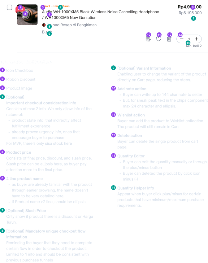
Product Information List of the product that already added the user to the cart page, consist of shop info, product info, notes, and etc.
image 456
Before
Problems
  • To much text, and the color contrast not balance so the product info looks crowded
  • Some action used the icon and text, some icons are not same so it seems like there is no harmony
  • Pricing under product name is inconsistent as product variants appear and product stock appears, price will be adjusted down
image
After
Solutions
  • Tone down the icon color and thickness become uniform so that looks unity and harmony
  • Some the action changed to icons so the interface looks balance
  • Product price moved to the top right and align with product name, so the price looks like continuation from top to bottom.
  • Delete action moves to quantity editor, so user can remove the product by clicking (-) icon
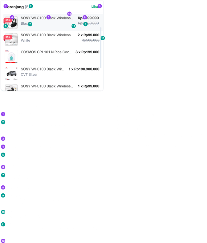
Mini Cart Dropdown List of the product preview that already added to cart page, so user can easily ensure the product success to added to cart without having to open the cat page first.
image 453
Before
Problems
  • Some user perception about this mini cart is not relevant because each added product does not appear at the top but randomly.
  • Variant product not shown on the list product while in the cart pages there appears
  • discount and slash price not shown too while in the cart pages there appears
  • Color of product price too contrast.
  • The information hierarchy is not obvious and crowded.
image
After
Solutions
  • Improvement of the logic, product that lates added will be appearing on the top of the list
  • Variant product are displayed below the product name
  • Discount labels are displayed on above the images like on the cart page, and slash price as representative of the discount are placed too on the below of price.
  • Quantity of the product are moved to beside of the price
  • Product name are tone down to regular font so the interface aren’t crowded again.
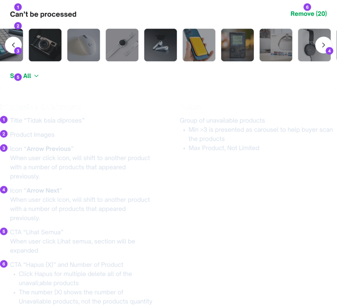
Group of Unavailable Products List of the product preview that already added to cart page, so user can easily ensure the product success to added to cart without having to open the cat page first.
image 433
image 436
Before
Problems
  • The color contrast not balance so the product info looks crowded
  • Unavailable information too contrast so it is looks like error info
  • Main action what should user doing is less prominent
  • Pricing under product name is inconsistent as product variants appear and product stock appears, price will be adjusted down
  • Can’t minimize the grouped list to compact
image 437
image 435
After
Solutions
  • Tone down some information so less prominent
  • Clear action what should be user doing of the product
  • Product price moved to the top right and align with product name, so the price looks like continuation from top to bottom.
  • Allow to minimize unavailable product group so that cart page can be less scrolling down to see other product below on the cart page
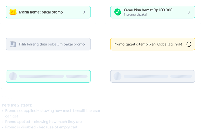
Sticky Action & Promo The main actions on the cart page to continue purchasing,
see the total purchases and apply vouchers and promotions.
image 452
Before
Problems
  • Promo widget color are less prominent and top position which make user less aware cause it so far from main button
  • Disabled button that looks like it is not the main action
image
After
Solutions
  • Improve the colors and icon of the promo widget to make it more prominent to encourage users to click on it
  • Main button always enable with green color to encourage user continue their purchase.
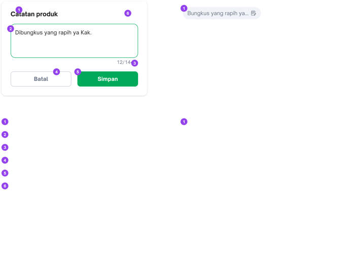
Add Product Notes Additional option for user who needs to add notes for their selected products
image 442
Before
Problems
  • Action for additional notes is still text and contrast color, Do the users think this is a mandatory action
  • The Text field is too small, so it can make user lose focus while typing.
image
After
Solutions
  • Action to added note changed to icons so the interface looks balance and clear
  • Appear the modal hen user wants to add a notes
  • Added notes are still displays as text inside the chips container.
Cart Page The main cart page include available, unavailable product, sticky action and promo widget
image 450
Before
Problems
  • To much text, and the color contrast not balance so the product info looks crowded
  • Some action used the icon and text, some icons are not same so it seems like there is no harmony
  • Pricing under product name is inconsistent as product variants appear and product stock appears, price will be adjusted down
  • Distance between product list is too closer
  • Proximity between available and unavailable product not clear
  • White background makes the eyes not focus on the products in the cart
image
After
Solutions
  • Tone down the icon color and thickness become uniform so that looks unity and harmony
  • Some the action changed to icons so the interface looks balance
  • Product price moved to the top right and align with product name, so the price looks like continuation from top to bottom.
  • Add thicker divider so that the distance between product list is more clear
  • Divide the available and unavailable product groups with separated container and background color is different so that proximity between both into clear and viewport of the content is more obvious
Interactive Prototyping As a cart page simulation to validate ideas, solution, functionality, and interaction before the product is build
Cart-page-animation-1
Testing &
Iteration
On this phase, I conducted usability testing the cart page to ensure and validate the new design I created.
Research methods Usability Testing
Objective To gather feedback on the new design cart desktop revamp
Sample Size 6 Interviewer
Key insights gathered
  • Mostly users have no problem using the new cart page design.
  • Mostly users have no problem and seamlessly to add and edit notes
  • Usually the users add notes to ensure that selected product variant is not incorrect during delivery
  • The Promo section is quite intuitive for most users, as the positions and colors are clear.
  • During testing:
  1. I tried to test the user to delete a product in the cart without displaying the trash can icon. The delete function can be done by clicking the icon (-) in the quantity editor, but the user found it difficult because this method is not common on desktop, so the user still needs the trash can icon to delete the product.
  2. Second, I tried asking users if they need to chat with the seller while on the shopping cart page "Before continuing to the payment process, have you ever asked (chatted) the seller first? The majority of users rarely chat with sellers because the products added to the shopping cart page have been asked before.
Iteration Base on key insight above, I iterate the design and fixed some parts that needed to be improve, including discussion with team and stakeholders.
Action Priority Matrix In this process, I prioritize this with internal teams and stakeholders, considering the effort and time required for development as well as the human resources used.

The Action Priority Matrix can help identify tasks to prioritize, optimize productivity, and reduce wasted time.
image
Quick Wins
  • Keep trash icon for delete action
  • Add number of item to Bulk select products
Major Project
  • Change variant product
  • Display Free Shipping badge
Fill-In/ Filler Task
  • Improve title font size for other modules on cart page
Thankless Task
  • Add a shop chat entry point
Final Design
Visual design Final design after iteration and discussion with our team, included tech team to ensure the UI and Interaction possibility so that the development process will run smoothly.
Components Most of the components I use are libraries provided by the design system team, to maintain the harmony of the interface and experience across the Tokopedia website and application and then design process will be more effective and efficient.
Cart-page-animation2
Sweat the details Component details included information architecture each component and rules
Fulfiller Level Information
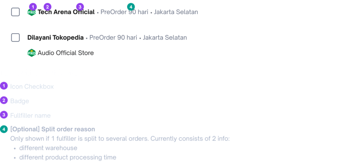
image
Product Level Information
image
Group of Unavailable Products
image
Add Product Notes
image
Group of Unavailable Products
image
Promo Widget
image
Microinteractions Interactions that aim to guide, increase awareness, provide feedback to users and display changes more clearly to a product.
Add Product Notes
Cart-addnotes
Unavailable Products Carousel
Results &
Impact
Measurable outcomes  Increase conversion from the Cart page to Order Created on the desktop.
How the design improved the user experience Users can shop easily and comfortably on the desktop page without being hampered by a boring experience like before.
Key Learnings
Challenges faced Collaboration with multiple divisions, stakeholders, data analysts, backend engineers and frontend engineers, to understand the needs and considerations of each division so that the development process can run smoothly. So that each part of the design or module that is developed can be delivered well and in accordance with the design made.
How the design improved the user experience This is a challenge for me because this project is quite large and has an impact on many tribes and divisions. So that in the future my collaboration can be better, getting closer because of frequent collaboration.
Copyright - All Material belongs to
PT Tokopedia
Tokopedia Cart Revamp Cart page on desktop
Scene 1 1
Copyright - All Material belongs to PT Tokopedia
Enhance the experience & interface, Improved information architecture, simplifying for the Cart page on Tokopedia desktop. Micro-interactions made the experience more delightful.

This project Increased conversion from Cart page to Order Created in session significantly.
Product Web Desktop
Contribution Interface Design
Experience Design
Interaction Design
User Research & Testing
Interactive Prototyping
Timeline Oct - Dec 2023
Project
Overview
The cart page is an intermediary page on the buyer funnel for users to collect, compare, and arrange their products before proceeding to checkout. From the number of daily users who add products to their cart, only one-third proceed to the checkout page while the rest are deleted and some are left in the cart.

There are two types of users based on their intentions, High-buying intention users usually buy products in a short time. Meanwhile, the low-buying intention user type takes longer to complete their shopping.
Role & Responsibilities
  • Responsible for projects involving & collaboration with several different tribes, such as the Promotion team, Dilayani tokopedia team, Recommendation team, and Basket Building Team,
  • Main role are as Interface design, Experience design, Research, Interaction design, and prototyper.
  • I work with the Design system team, Product manager, Product Design Lead, Front end engineer, backend, Data Engineer, and ux writer
Tools and methods used
  • Figma, Docs, Jira.
  • Collaboration, Usability testing, Affinity mapping.
Problem Statement
What problem were you solving?
  • We aim to refresh the UI of the Cart & Checkout pages on the desktop since the design has been far behind for quite a long time. 
  • Many business initiatives that are currently running in apps are not provided on the desktop
  • Improve performance and scalability
  • Improve the user experience
Why was it important? Causing a pain point of inconsistency for users when using Tokopedia. Pursuing design parity across Apps, LITE, and Desktop platforms can benefit us in ensuring that all users have equal access to the platform's resources or services, regardless of their background, capabilities, or location.
Research
Research methods
  • User Interview / User Testing
  • Performance Data
  • RAD Report
  • Competitive Research
  • Affinity Mapping
Key insights gathered
  • The majority of users use the desktop to search for items, compare them, and add them to the cart to then check out on mobile.
  • Some pay attention to items that are urgent to buy
  • Some only want to know the shipping price to compare
  • The user interface is not updated so it is not attractive and to much text, and then the program code is outdated so it is not scalable.
  • Most competitors have a clean and modern interface, making it easier for users to see and differentiate each part of the content presented.
Design Principle As the essential part of the buying journey, cart aim to be smart modules that help customer to purchase, maximize benefit, and manage their transaction easily. This is with principles that cart should be relevant, empowering, reliable, and engaging.
Cone_01 2
Relevant
Sphere 1
Empowering
Cube_02 1
Reliable
Icosahedron 1
Engaging
Relevant The information we show on cart page should be relevant based on the user behavior.
Empowering All the information presented is easy to understand (copywriting and the design straight forward) and based on the maturity level of their decision-making process.
Reliable Users can be ensured that they can understand the details of their purchase (Transparent / clear information)
Engaging The information structure and communication would be delivered in a manner that is easy to grasp, just like reading a quick story about your purchase.
Ideation Process Based on the research insight above, I and team conducted brainstorming to gain new ideas and various solutions. The method that we use to narrowing ideas is a How Might We? (HMW) to explore ideas are possible solutions, low effort and hight impact.
Problem
The user interface is not updated so it is not attractive and to much text, and then the program code is outdated so it is not scalable.
User with Low-Buying Intentions takes longer to complete their shopping because they only add products to their cart to save temporarily and then compare. Then continue shopping on mobile because free shipping vouchers are not available on desktop.
How Might We?
  • How might we design a cart page that makes it easy user for complete their shopping?
  • How might we design the cart page more attractive dan user-friendly?
  • How might we design the cart page more modern while still being useful and user-friendly?
  • How might we design free shipping vouchers that can be used on the desktop?
  • How might we design a cart page that displays free shipping vouchers that ase easy to use to complete shopping on the desktop?
Information Architecture IA of Cart page tokopedia desktop, Mapped so can make it easier to created or improve cart page.
image 448
User Flow The user Journey start from Tokopedia Home page to completing their purchase
image 451
Design Solution On this phase I am explore a lot of design of some part and modules, Starting on a main cart page, mini cart dropdown, add to wishlist, add notes, ribbon, product price, promo widget and unavailable product.
Product Information List of the product that already added the user to the cart page, consist of shop info, product info, notes, and etc.
image 456
Before
image
After
Problems
  • To much text, and the color contrast not balance so the product info looks crowded
  • Some action used the icon and text, some icons are not same so it seems like there is no harmony
  • Pricing under product name is inconsistent as product variants appear and product stock appears, price will be adjusted down
Solutions
  • Tone down the icon color and thickness become uniform so that looks unity and harmony
  • Some the action changed to icons so the interface looks balance
  • Product price moved to the top right and align with product name, so the price looks like continuation from top to bottom.
  • Delete action moves to quantity editor, so user can remove the product by clicking (-) icon
Mini Cart Dropdown List of the product preview that already added to cart page, so user can easily ensure the product success to added to cart without having to open the cat page first.
image 453
Before
image
After
Problems
  • Some user perception about this mini cart is not relevant because each added product does not appear at the top but randomly.
  • Variant product not shown on the list product while in the cart pages there appears
  • discount and slash price not shown too while in the cart pages there appears
  • Color of product price too contrast.
  • The information hierarchy is not obvious and crowded.
Solutions
  • Improvement of the logic, product that lates added will be appearing on the top of the list
  • Variant product are displayed below the product name
  • Discount labels are displayed on above the images like on the cart page, and slash price as representative of the discount are placed too on the below of price.
  • Quantity of the product are moved to beside of the price
  • Product name are tone down to regular font so the interface aren’t crowded again.
Group of Unavailable Products List of the product preview that already added to cart page, so user can easily ensure the product success to added to cart without having to open the cat page first.
image 458
Before
image 459
After
Problems
  • The color contrast not balance so the product info looks crowded
  • Unavailable information too contrast so it is looks like error info
  • Main action what should user doing is less prominent
  • Pricing under product name is inconsistent as product variants appear and product stock appears, price will be adjusted down
  • Can’t minimize the grouped list to compact
Solutions
  • Tone down some information so less prominent
  • Clear action what should be user doing of the product
  • Product price moved to the top right and align with product name, so the price looks like continuation from top to bottom.
  • Allow to minimize unavailable product group so that cart page can be less scrolling down to see other product below on the cart page
Sticky Action & Promo The main actions on the cart page to continue purchasing,
see the total purchases and apply vouchers and promotions.
image 452
Before
image
After
Problems
  • Promo widget color are less prominent and top position which make user less aware cause it so far from main button
  • Disabled button that looks like it is not the main action
Solutions
  • Improve the colors and icon of the promo widget to make it more prominent to encourage users to click on it
  • Main button always enable with green color to encourage user continue their purchase.
Add Product Notes Additional option for user who needs to add notes for their selected products
image 461
Before
image 460
After
Problems
  • Action for additional notes is still text and contrast color, Do the users think this is a mandatory action
  • The Text field is too small, so it can make user lose focus while typing.
Solutions
  • Action to added note changed to icons so the interface looks balance and clear
  • Appear the modal hen user wants to add a notes
  • Added notes are still displays as text inside the chips container.
Cart Page The main cart page include available, unavailable product, sticky action and promo widget
image 450
Before
image
After
Problems
  • To much text, and the color contrast not balance so the product info looks crowded
  • Some action used the icon and text, some icons are not same so it seems like there is no harmony
  • Pricing under product name is inconsistent as product variants appear and product stock appears, price will be adjusted down
  • Distance between product list is too closer
  • Proximity between available and unavailable product not clear
  • White background makes the eyes not focus on the products in the cart
Solutions
  • Tone down the icon color and thickness become uniform so that looks unity and harmony
  • Some the action changed to icons so the interface looks balance
  • Product price moved to the top right and align with product name, so the price looks like continuation from top to bottom.
  • Add thicker divider so that the distance between product list is more clear
  • Divide the available and unavailable product groups with separated container and background color is different so that proximity between both into clear and viewport of the content is more obvious
Interactive Prototyping As a cart page simulation to validate ideas, solution, functionality, and interaction before the product is build
Cart-page-animation-1
Testing &
Iteration
On this phase, I conducted usability testing the cart page to ensure and validate the new design I created.
Research methods Usability Testing
Objective To gather feedback on the new design cart desktop revamp
Sample Size 6 Interviewer
Key insights gathered
  • Mostly users have no problem using the new cart page design.
  • Mostly users have no problem and seamlessly to add and edit notes

  • Usually the users add notes to ensure that selected product variant is not incorrect during delivery
  • The Promo section is quite intuitive for most users, as the positions and colors are clear.
  • During testing:
  1. I tried to test the user to delete a product in the cart without displaying the trash can icon. The delete function can be done by clicking the icon (-) in the quantity editor, but the user found it difficult because this method is not common on desktop, so the user still needs the trash can icon to delete the product.
  2. Second, I tried asking users if they need to chat with the seller while on the shopping cart page "Before continuing to the payment process, have you ever asked (chatted) the seller first? The majority of users rarely chat with sellers because the products added to the shopping cart page have been asked before.
Iteration Base on key insight above, I iterate the design and fixed some parts that needed to be improve, including discussion with team and stakeholders.
Action Priority Matrix In this process, I prioritize this with internal teams and stakeholders, considering the effort and time required for development as well as the human resources used.

The Action Priority Matrix can help identify tasks to prioritize, optimize productivity, and reduce wasted time.
image
Quick Wins
  • Keep trash icon for delete action
  • Add number of item to Bulk select products
Major Project
  • Change variant product
  • Display Free Shipping badge
Fill-In/ Filler Task
  • Improve title font size for other modules on cart page
Thankless Task
  • Add a shop chat entry point
Final Design
Visual design Final design after iteration and discussion with our team, included tech team to ensure the UI and Interaction possibility so that the development process will run smoothly.
Components Most of the components I use are libraries provided by the design system team, to maintain the harmony of the interface and experience across the Tokopedia website and application and then design process will be more effective and efficient.
Cart-page-animation2
Sweat the details Component details included information architecture each component and rules
Fulfiller Level Information
image
Product Level Information
image
Group of Unavailable Products
image
Add Product Notes
image
Group of Unavailable Products
image
Promo Widget
image
Microinteractions Interactions that aim to guide, increase awareness, provide feedback to users and display changes more clearly to a product.
Add Product Notes
Cart-addnotes
Unavailable Products Carousel
Results &
Impact
Measurable outcomes  Increase conversion from the Cart page to Order Created on the desktop.
How the design improved the user experience Users can shop easily and comfortably on the desktop page without being hampered by a boring experience like before.
Key Learnings
Challenges faced Collaboration with multiple divisions, stakeholders, data analysts, backend engineers and frontend engineers, to understand the needs and considerations of each division so that the development process can run smoothly. So that each part of the design or module that is developed can be delivered well and in accordance with the design made.
How the design improved the user experience This is a challenge for me because this project is quite large and has an impact on many tribes and divisions. So that in the future my collaboration can be better, getting closer because of frequent collaboration.
Copyright - All Material belongs to PT Tokopedia
© Copyright All Material belongs to PT Tokopedia